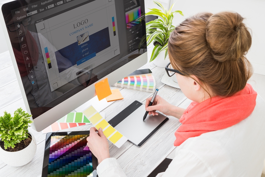
Whether on balloons or the range of other promotional objects, logos warrant a fair amount of consideration when it comes to their design. At Fill ‘n’ Away, we deal with a lot of logos on a daily basis.
Luckily, there are some tried and trusted methods for effective logos, and if you follow the best practices below, you won’t fall too far short of something which is both eye-catching and memorable.

Be Original
Don’t be afraid to do whatever it takes to grab attention. A logo should be a beacon and symbol for your organisation, and while it is important to have your eyes on what is trendy and relevant, being a sheep and following the crowd will only result in a logo which does not invite a second glance.
Keep It Simple
Some designers fall into the trap of applying shadows to logos, and while they can offer depth, shadows can also over complicate logos unnecessarily. Shadows also add to the media size of jpegs and pngs that will be the digital form of many logos – clogging up recipients’ inboxes is never welcomed! Keep it simple and don’t shadow for the sake of it; your logo and brand name should be the star of the show.

Bold is Better
Logos which are over detailed can confuse the issue. Clear, bold and powerful is often the way to go, without intricate patterns and peripheral features which can detract from the main messaging. A logo is about drawing attention to one or a small number of words.
The Two Font Rule
While two fonts can make a nice match on a logo, three is almost definitely an unwanted crowd. If you don’t want to avoid ‘crowding out’ the power of your messaging, stick to one or two fonts to get the point across. If you are choosing two, you must make sure they work with each other well. Bold and heavy goes well with an elegant and thin font, and you should also give plenty of thought to which colours you select – they should complement rather than compete with each other.

To discuss how your logo could work on our range of promotional balloons, contact us today.
